Hello!
Today I'd like to share a layout I have made for
The Mad Scrapper Blog and I have used a selection papers, flowers and ephemera from 49-and-market . You can find a full list below.
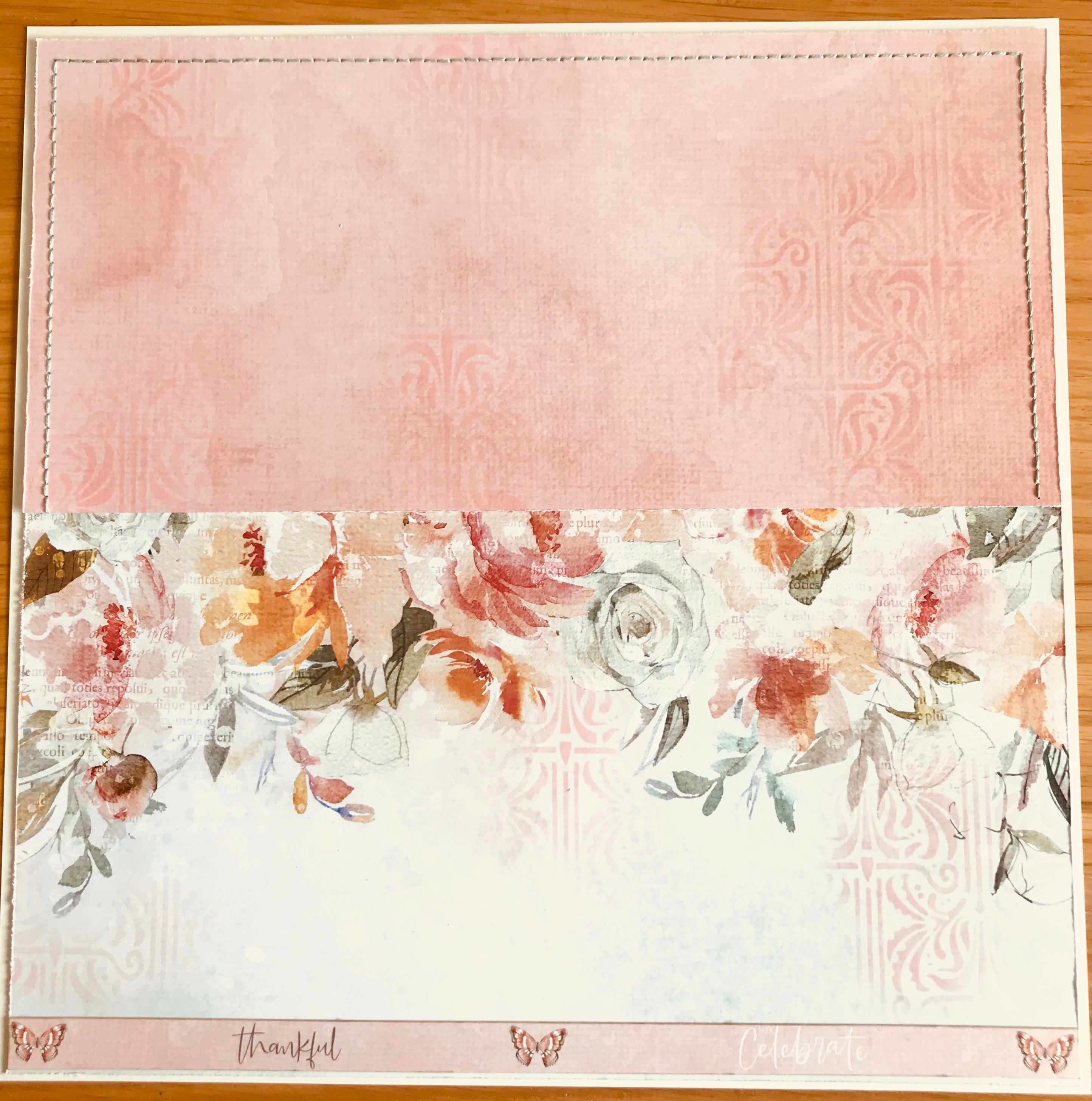
I started by cutting in half the Precocious page and the Flutterbies and trimmed both to 11.5" by 12" and mounted on to a cream smooth card. I stitched around the 3 sides of the flutterbies with a sage green floss. I also inked through the Tapestry stencil with Saltwater Taffy ink. I used the manufacturer strip from Precocious paper at the bottom.
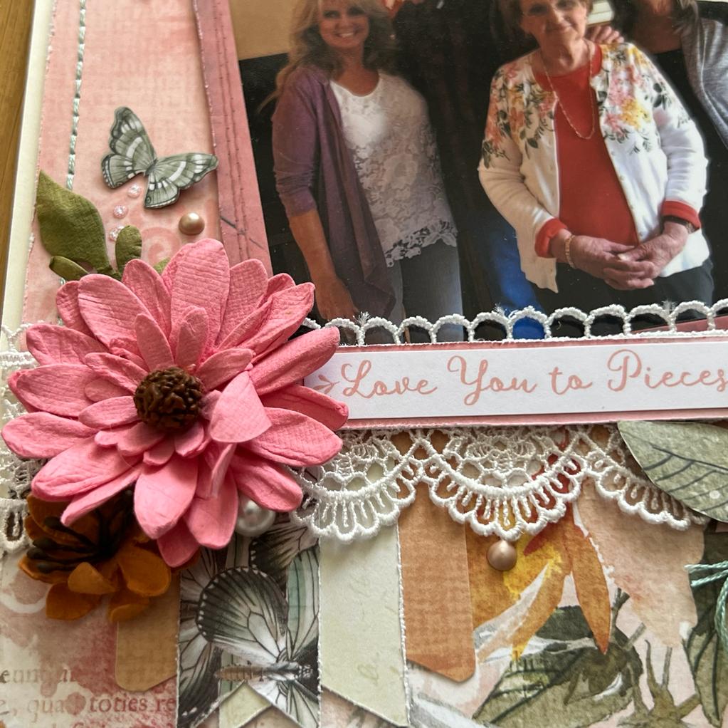
The next few photos show how I have used the Laser cuts, flowers and leaves to build up the layout. I added some medium deep lace across the centre join, even though you don't see much of it but it does go all the way.
I put both photographs under faux stitched frames from the Laser-cut pack and lifted both on foam so I can tuck bits underneath. The Smile is from the same pack and it fits perfect.
This little sentiment is from Cocoa Vanilla, I keep all little bits because you never know when you'll need it! I made 3 fishtail banners to hang under the lace.
I love the little butterflies from the Laser-cuts so I dotted a few about. You can see how I have lifted the acetate leaves from the paper.
Aren't those photo frames great? I made a doily from a scrap of paper and tucked it under and added acetate leaves and a couple of file tabs.
Here you can see the stencilling a little better.
To finish off today I added pearls, Nuvo drops and a touch more floss. I hope I have inspired you to cut up and move around your papers to fit your layout idea. Check out more papers at
The Mad Scrapper or even better call in to the store.
Sue
Please find a list of products used from the store:
ARToptions Laser cuts Avesta
Acetate Leaves by 49andmarket both out of stock but you may already have them.


Comments
Leave a comment